TSURU
branding / print / digital design
Tsuru is a Japanese-French fusion restaurant located in Downtown Vancouver. The atmosphere of the restaurant is high-end, minimalistic and elegant. Tsuru incorporates traditional Japanese interior design with modern furnishings which epitomize the fusion of Japanese and French culture.
The Concept: Tsuru means “crane” in Japanese. Inspired by the origami crane, the crane symbolizes beauty, harmony, and happiness. Likewise, Tsuru signifies the harmony of Japanese and French cuisine.


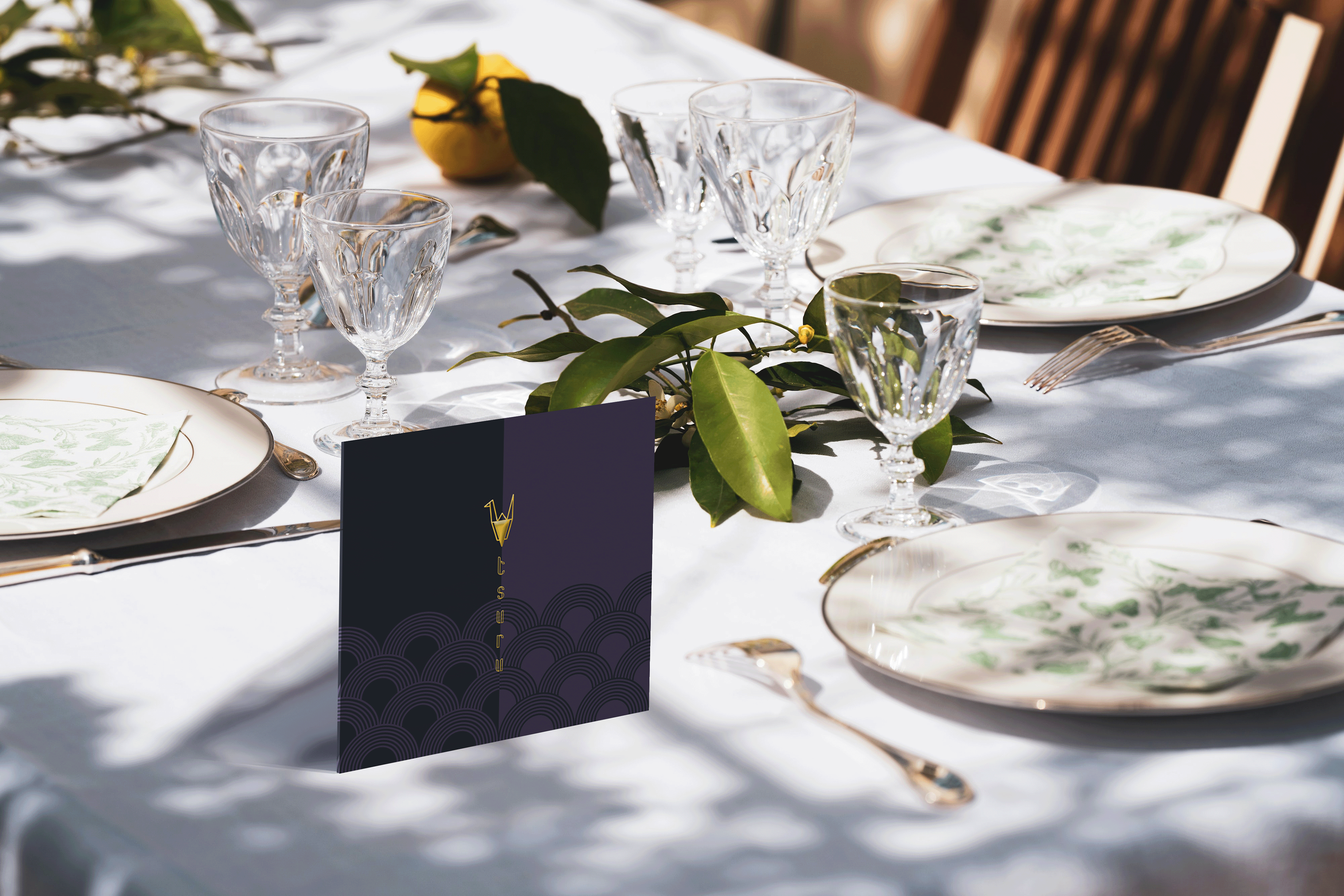
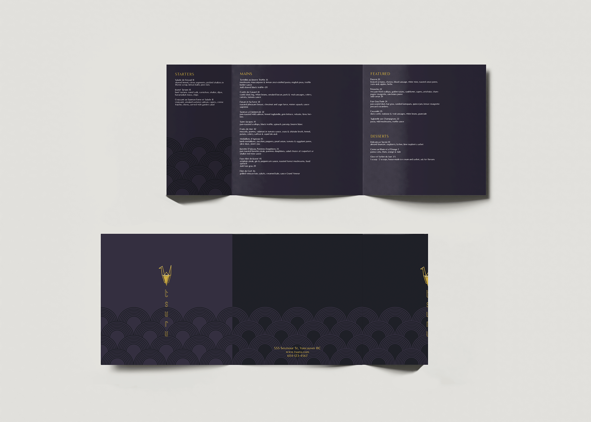
The printed menu is square to resemble origami paper and is unfolded into an exquisite dining experience. To give a traditional touch, Wagara, a traditional Japanese pattern, is used to create an eye-catching, weaved pattern that looks like a sea of clouds. A triad colour scheme of midnight blue, burgundy red and gold foil not only creates a luxurious, elegant appearance, but are common colours that are used in Japanese lacquerware. To ensure the text is easy to read, an off-white cream colour is also used to create a clear contrast.
The digital tablet menu uses a dark background since this is better suited for a dimly lit environment and won’t put strain on the reader’s eyes. The patterns are carried throughout the digital menu to create a cohesive look with the rest of the branding. The continuous scroll design incorporates plenty of white space so that the user is able to properly navigate through the tablet while reading.
Programs Used: Adobe InDesign / Adobe Illustrator / Adobe Photoshop

