PHARMILY
UX UI / application design
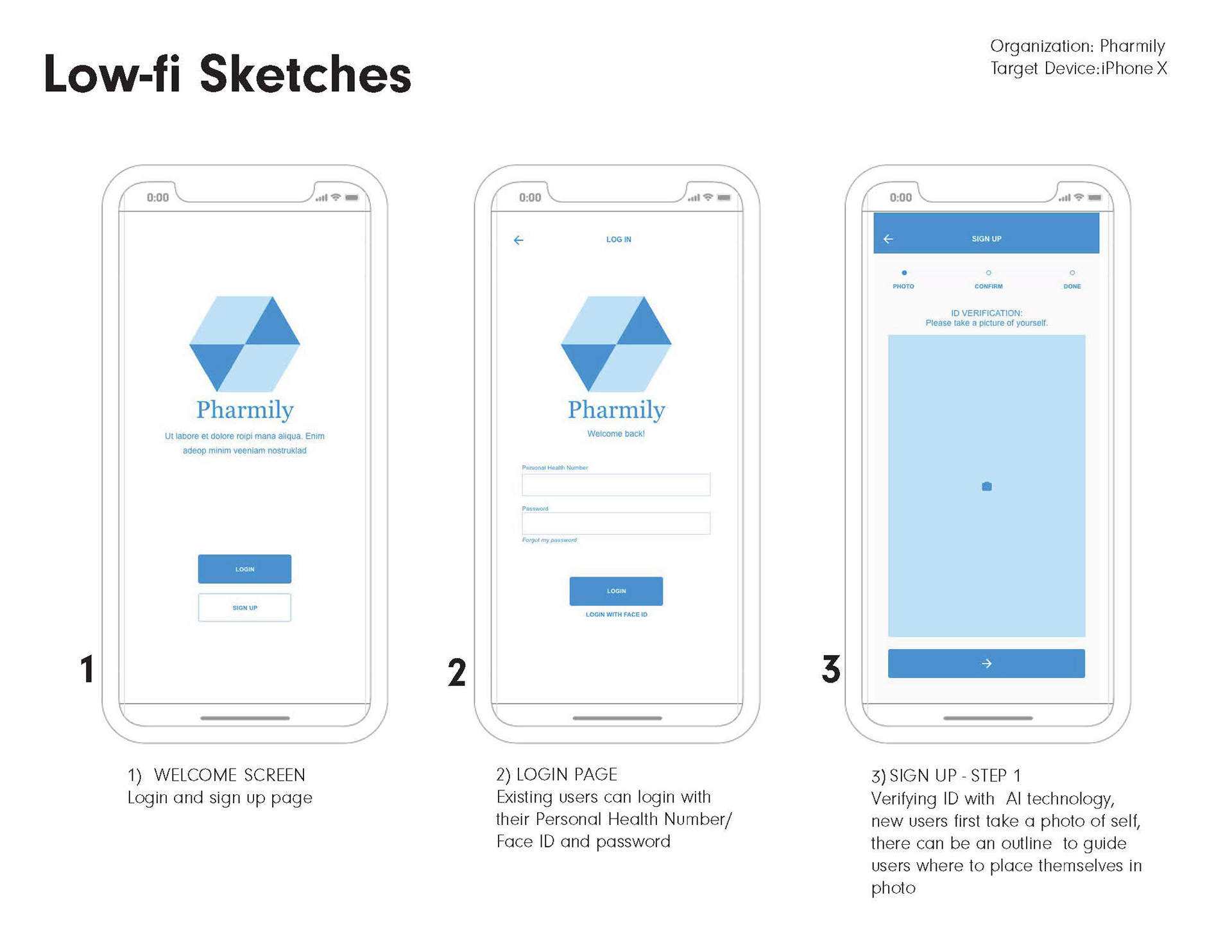
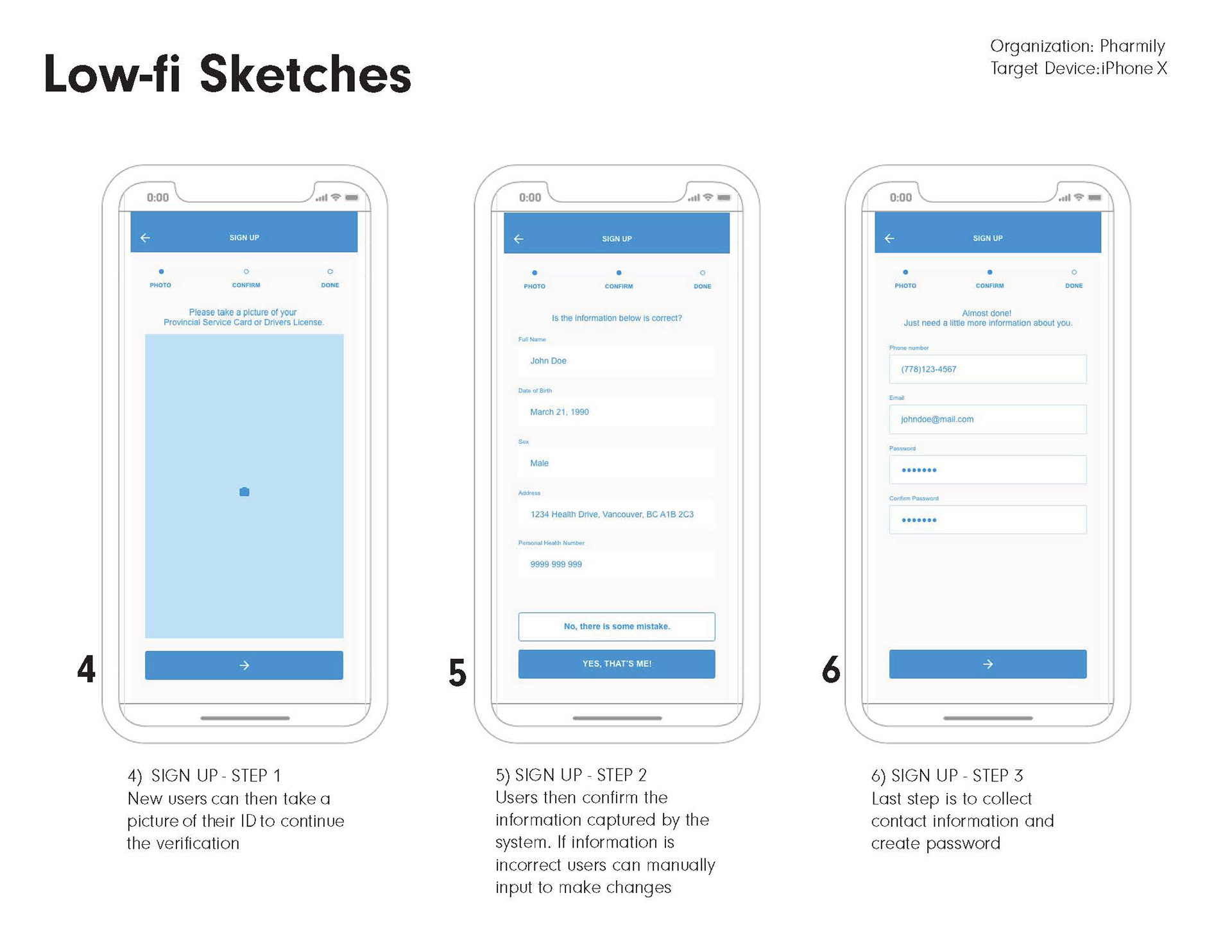
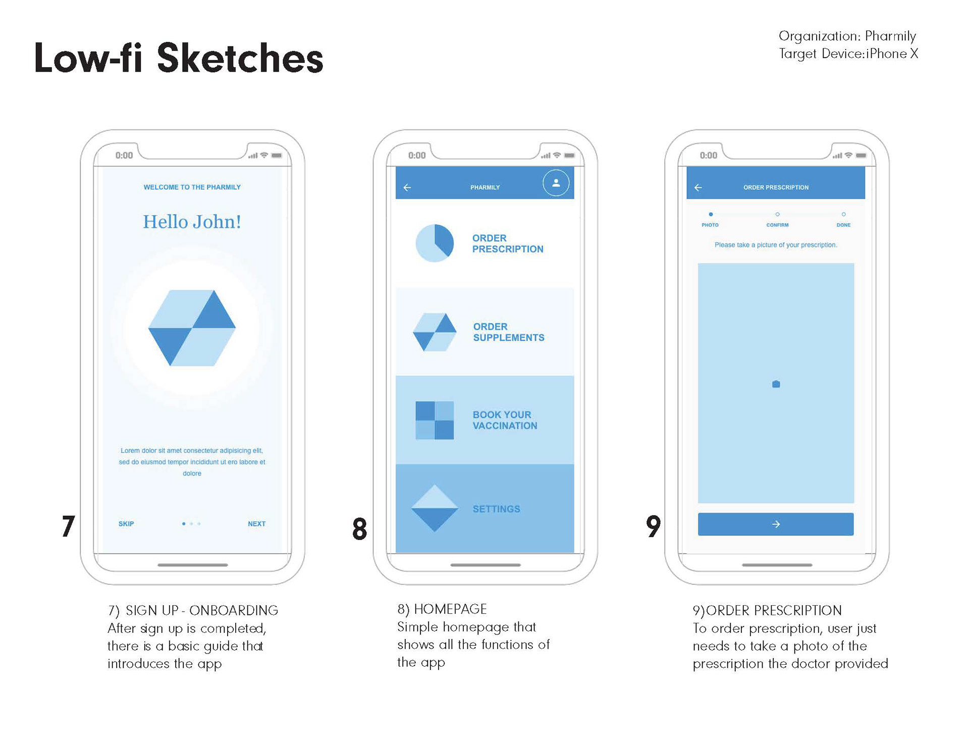
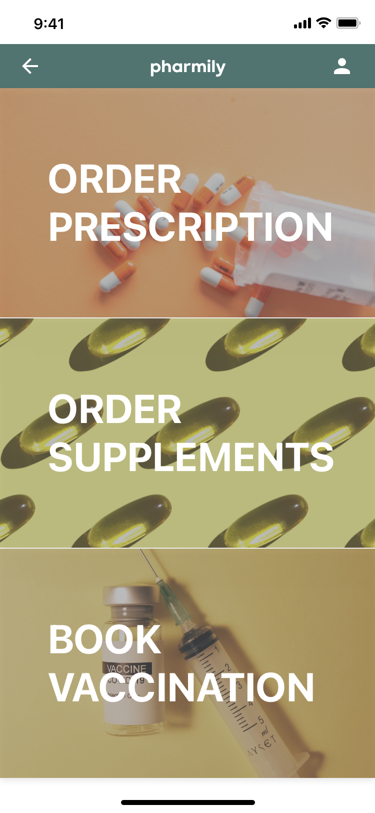
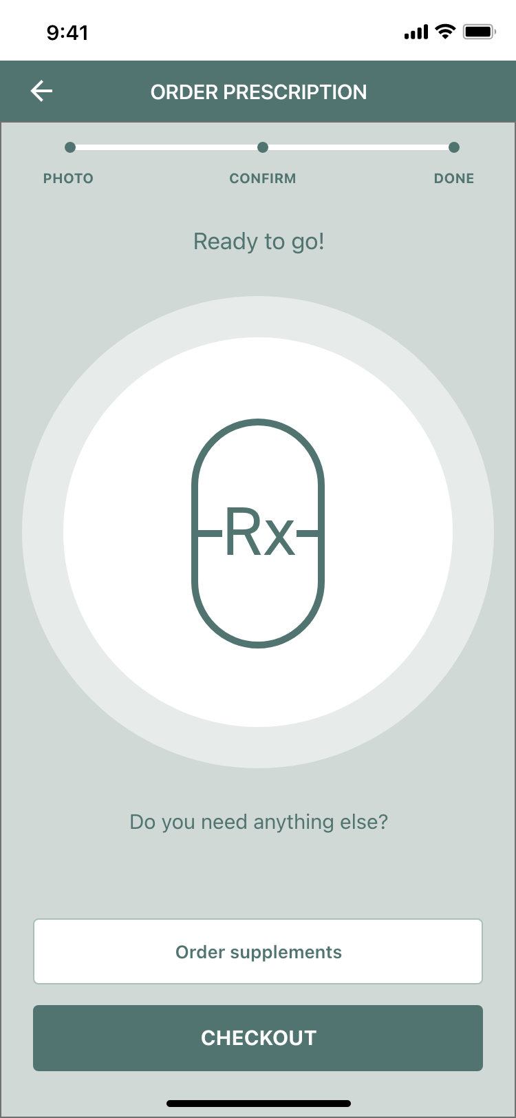
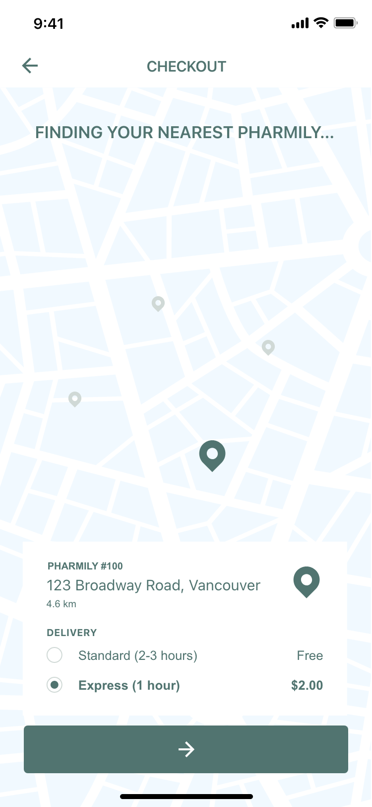
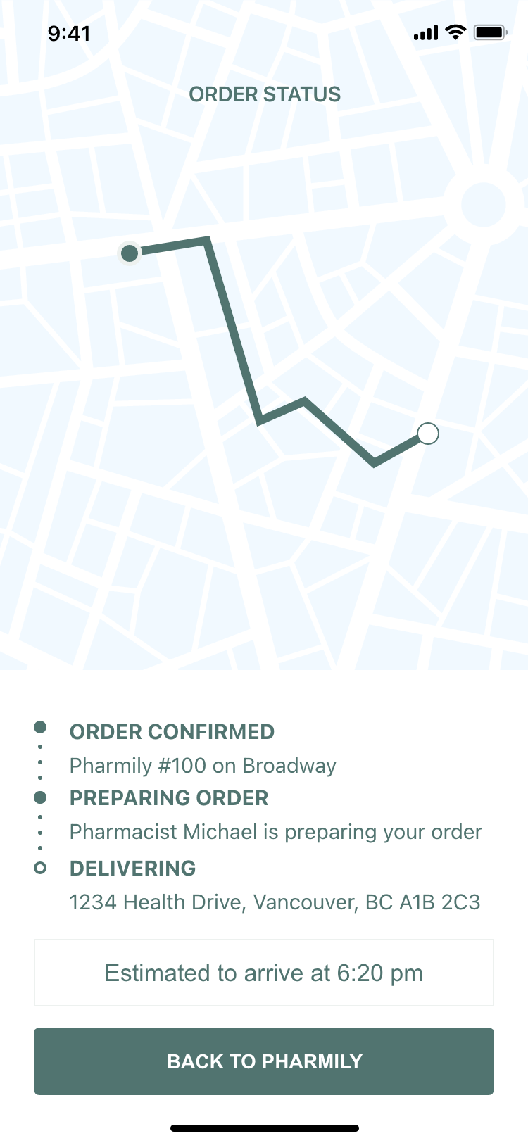
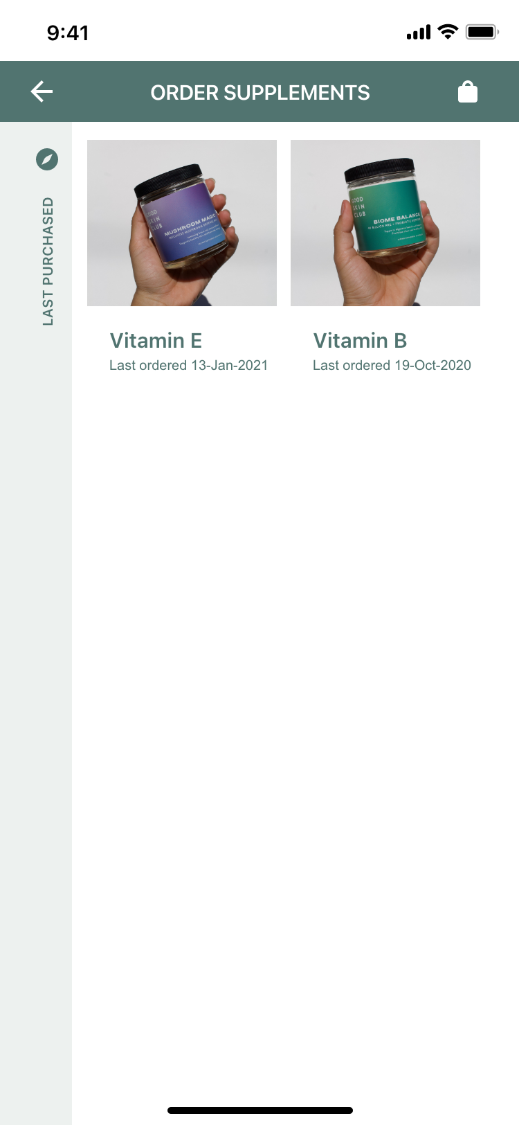
User Story: Pharmily is a local pharmacy in Vancouver that provides prescription drugs, vaccinations and everyday supplements. Their app allows users to order medication conveniently and get it delivered to their home within the day. After placing order, user can get updates on their delivery and manage payments & order through the app. Besides prescriptions, users can also purchase supplements and schedule vaccination appointments at their local Pharmily through the app.
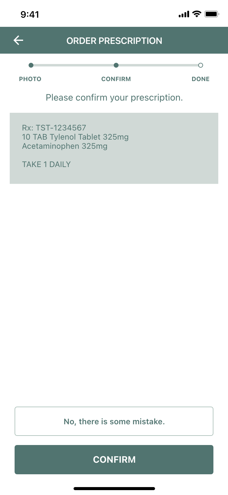
Task-Based Scenario: Order prescription and deliver to home at 1234 Health Drive, Vancouver BC.
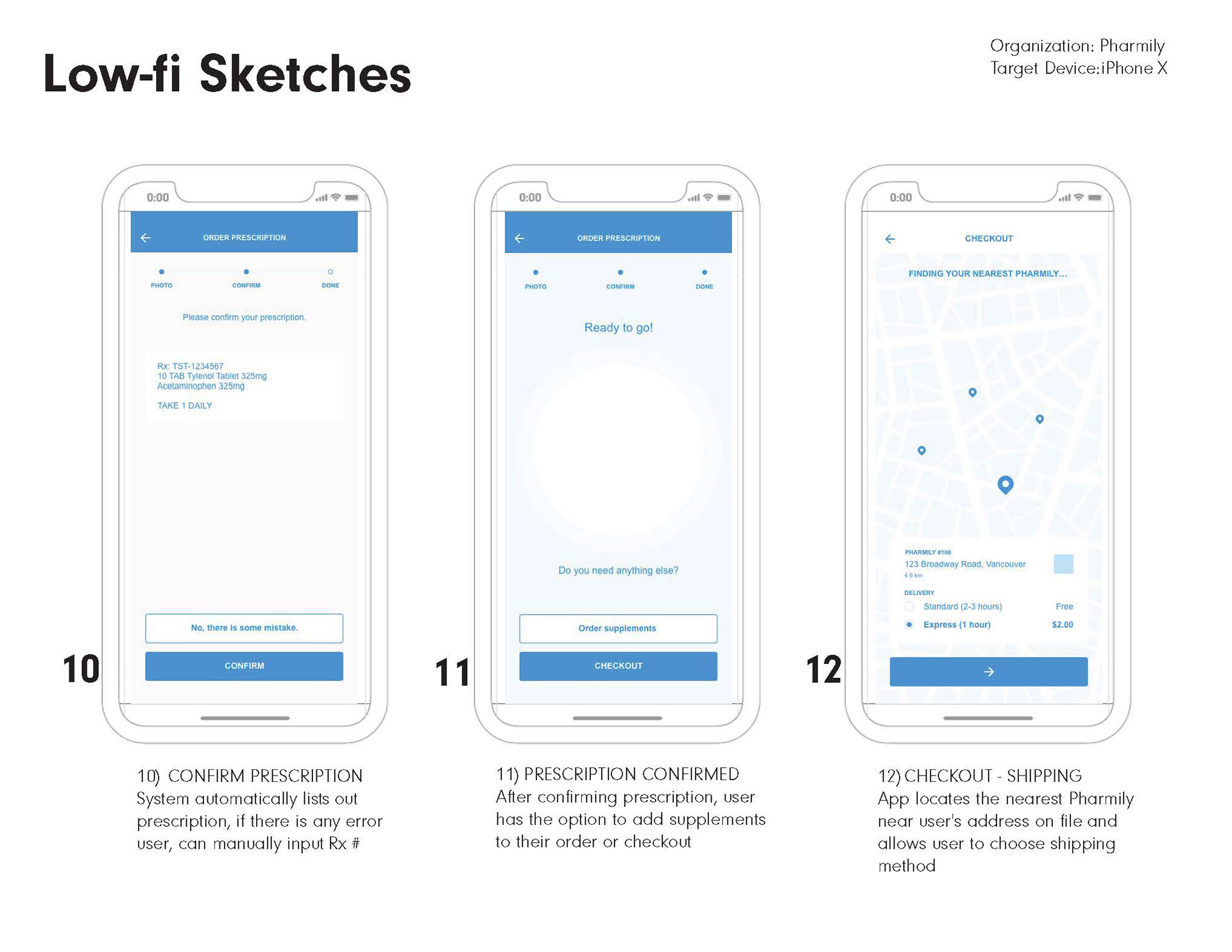
The Pharmily health app is created for all age groups, but I focused my target audience to working individuals, users ages 25-50 years old, often too busy or occupied to take care of their health. The application is designed to make health more convenience without needing to visit a pharmacy. The user flow is focused on ensuring users go through the task-based scenario successfully with as few steps possible.


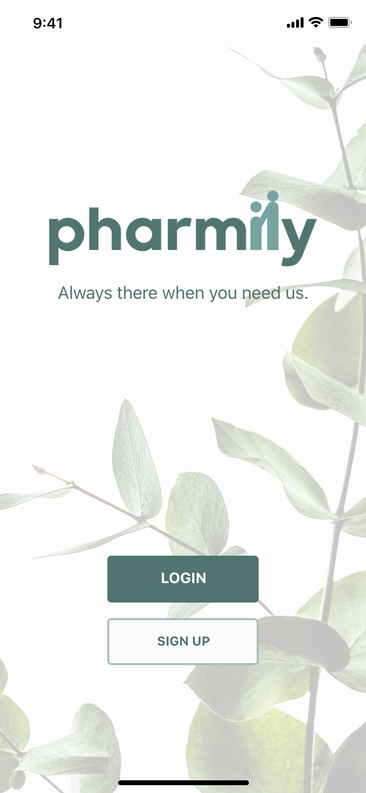
The colour green associates with nature and represents growth, harmony and renewal. Out of all the colours, green is also regarded as the most restful and relaxing colour for the human eye. For the branding, Pharmily uses a monochromatic green colour scheme for a calming, clean design. A sans serif font creates a modern, simplistic design and makes it easy to read. Buttons and icons are designs are kept at a minimal to ensure it is easily accessible to users of all ages.

Programs Used: Adobe Illustrator / Adobe XD
Photos from unsplash.com
Photos from unsplash.com
